

Updated August 2026. The framework in this article still holds, though some examples and year references had gone stale. It was reviewed in August 2026 so traders can read it as a current guide rather than an archived explainer.
The past often repeats itself, and that is especially true in the stock market. Investors who spend time studying how assets behave under different conditions can often spot similar setups in the current market. A close look at how assets gained and lost value historically can surface consistent patterns that, combined with extra analysis of relevant factors, can support a more accurate read of future performance.
One way to collect that information is to study trading chart patterns. These are shapes that appear on a stock chart and hint at what a given stock might do based on what it did before. Once you can recognize those shapes and what they imply, you can make more informed decisions whether the market is rising or falling.
Black Eagle Financial Group is one of the most well-respected proprietary trading firms in NYC. We prepared this guide to describe the most frequently used price chart patterns and what they mean so you can implement them into your trading activities.
Technical Analysis Pattern Categories
Traders study past asset performance using three categories of stock chart patterns. Most assets see each of them at some point.
Continuation
The current trend is on track to continue on the same trajectory.
Reversal
The current course will change direction.
Bilateral
Volatility in the market could cause the trend to veer in either direction.
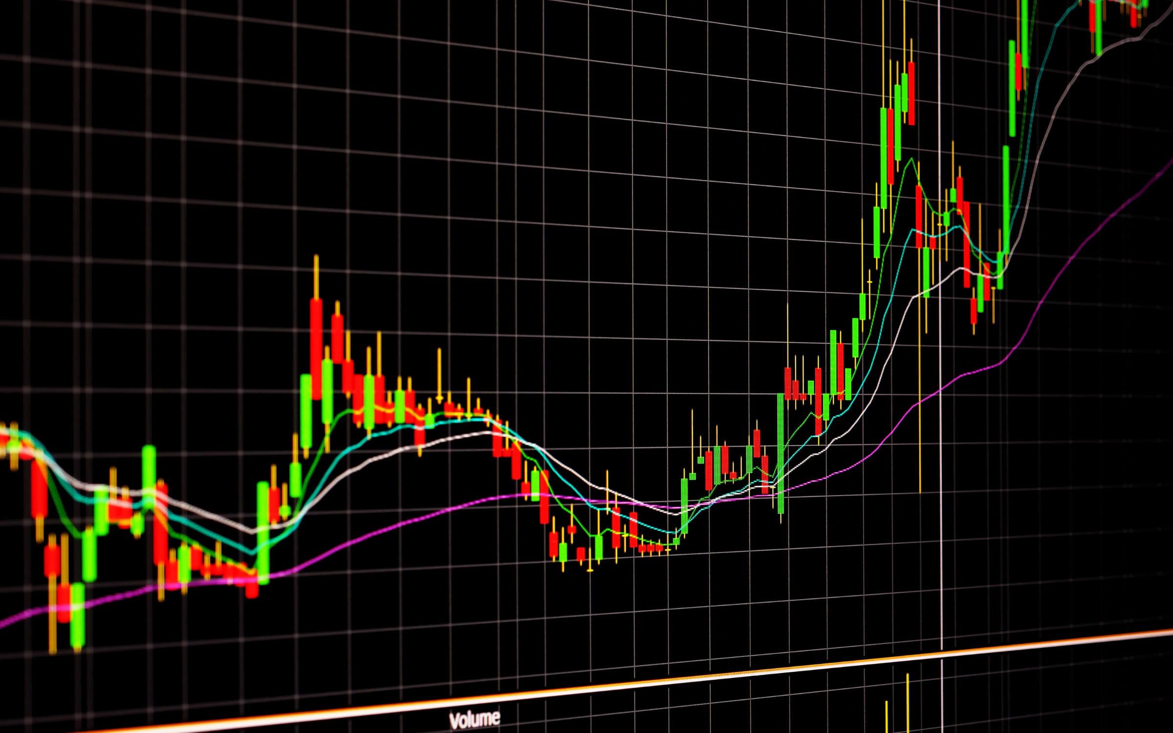
Candlestick trading typically relies on trading chart patterns. Traders track candlestick patterns to anticipate market moves using the shape and color of the candlesticks on the chart.
Applying patterns to performance can identify trends, but none are 100% accurate. At most, there’s about an 89% chance that you can make an accurate prediction based on a chart, so investors and traders should never rely entirely on this type of technical analysis as their only tool.
How Resistance and Support Inform Pattern Development
Knowing where support and resistance sit is essential when you build trading strategies around chart patterns.
Support is the level at which the stock’s price stops falling and begins an upward trend. Resistance is the opposite: the increase stalls out and the asset price starts declining.
The Most Effective and Accurate Chart Patterns Used for Technical Analysis
Most traders use these technical analysis patterns to analyze market trends:
1. Ascending and Descending Staircases
Stock prices do not rise or fall in a straight line. They move in small increments. If they keep heading in one general direction, though, they form an ascending or descending staircase.
Staircases can point to chances to act quickly on short-term market changes. Selling an asset that’s on a general downward trend when it’s experiencing a small upward blip, for example, can limit losses.
2. Head and Shoulders
A head and shoulders pattern shows a high peak with slightly lower ones on either side. They typically flag a downward reversal because, although each peak falls back to the same support, once the third peak hits that level, the asset usually starts trending lower.
3. Double-Bottom
A double-bottom trend typically flags an upward reversal. It shows up during a stretch of selling that drops the asset to support. Price then moves up toward resistance, falls back to support, and then starts moving higher again in a generally positive direction.
4. Rounded Top and Bottom
Rounded top or bottom trading chart patterns also signal reversals. The rounded top is an inverted U that shows assets trending downward, while the rounded bottom is the opposite: a U shape showing an upward trend. These are typically gradual changes that show up over several trading sessions.
5. Pennants or Flags
Stretches of upward momentum followed by consolidation and decline form a pennant or flag on the chart. The pennant shape appears because there is usually an initial burst of large increases followed by smaller fluctuations.
6. Wedge
When an asset’s price stays between two sloping support and resistance lines, that is a wedge pattern. A rising wedge has a steeper support line, pointing to a more lasting price decline when it breaks below that line. A falling wedge has a steeper resistance line, showing that the price can keep rising even after it passes that line.
7. Cup and Handle
A cup and handle is a continuation pattern that combines the rounded bottom and wedge patterns. The U of the cup shows a gradual upward trend until the asset goes through a stretch where price declines, but only inside the two parallel lines of a wedge-type graph. Eventually, price tends to break through resistance and resume the upward trend.
8. Symmetrical Triangle
Watching a symmetrical triangle is useful in a volatile market, because it is a bilateral pattern that can hint at the stock’s overall direction. These triangles form when prices converge as highs get lower and lows get higher.
There may be no clear indication as to which way the value will move before the triangle forms. However, once it does, prepare for a breakout in either direction.
Make the Most Informed Trading Decisions with Black Eagle Financial Group
By combining elements of a hedge fund and financial services firm, Black Eagle Financial Group strives to help traders maximize their results with support, tools, and resources that help them build their skills and take their investments to new heights. With expert guides, insights into trading psychology, and support to secure your capital, manage risks, and maintain compliance, we’ll help you achieve your goals without excessive costs or risk.
Connect with us by calling (833) 253-2453 and learn more about using trading chart patterns as part of a profitable investment strategy.
Frequently Asked Questions
Review these common queries about stock chart patterns and how to use them.
What Is the Best Way to Learn Trading Chart Patterns?
The best way to learn how to recognize and interpret trading chart patterns is to compare them against historical data to see how prices fluctuate in various market conditions. Use chart pattern recognition algorithms to apply different options to previous information to see where they overlap.
Are Patterns Accurate?
No, stock chart patterns are not always infallible; at most, they work for predicting trends between 50% and 89% of the time. They can show false signals, so combine them with other indicators and analysis methods for the most complete picture.
Which Pattern Is Best for Trading?
Most experts agree that head and shoulders are the most reliable trading chart patterns, especially for spotting trend reversals.
What Timeframe Do Investors Use to Identify Pricing Patterns?
Daily or weekly timeframes that identify an asset’s course are useful for identifying long-term patterns. Shorter intervals (like every five or 15 minutes) make it easy to spot the best entry and exit points.
Current as of August 2026
Markets in 2026 still pay for the same unglamorous skills: reading structure, defining risk before entry, and skipping setups that only work in a backtest. What changed is the environment around those skills — faster options expiry, more retail 0DTE flow, and more prop-firm offers that look like careers but are paid tests. Use this page for the core idea (pattern, strategy, career path, or regulation). Then check current contract specs, firm agreements, and hiring reality before you act on it. Where the original draft treated a past year as “now,” this revision treats August 2026 as now.


